Global Navigation Menu
Wargaming
An award-winning online game developer and publisher
Website | Web Tablet | Web Mobile
Overview
Role & Duration
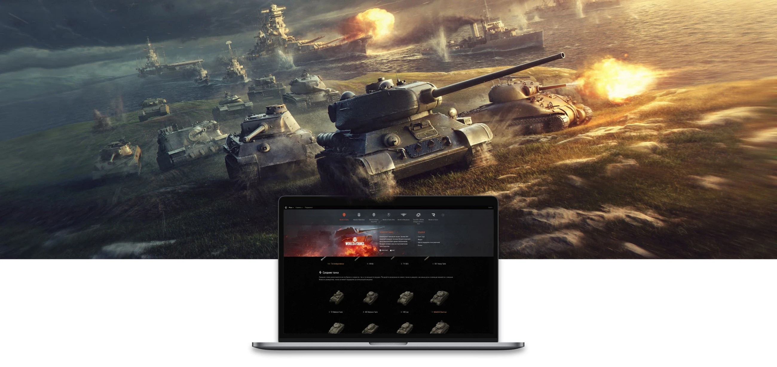
Action games developed by Wargaming are played by more than 150 million people all over the world. This makes working on any design project for this company twice as fascinating and engaging. The interface must be easy-to-use and intuitive for every gamer across the globe.
Mission: We deliver legendary online games. Globally. With passion.
Sr. Product Designer
Aug 2014 - Jun 2019
-----------------------------------------------------
Team:
11 Product Designers (In-house Agency)
Product Manager
Project Manager
Bussiness Analytic
UX Lab
3 QA
4+ Developers
------------------------------------------------------
20+ Locations around the world
200M+ Fans all over the globe
A leading free-to-pay company

My Role
In Wargaming, I relied on user-centered design principles to produce high-quality visuals—from concept to execution—across many platforms. I collaborated with fellow designers to constantly refine the Wargaming design language and create innovative, great-looking products that people still love to use.
In terms of details, I led two projects:
1. One is the “Global menu of the Wargaming”
2. The other is “WOT Blitz - A web platform for the mobile game”.
In all these projects I implemented visual design systems across a range of platforms.
In addition to this, I managed to:
• Contributed to the development of the company's identity visual style, logotypes, and icons;
• Experienced implementing visual design systems across a range of platforms in an iterative software development environment;
• Think holistically about the brand across multiple surfaces and platforms;
• Create components and guidelines to be adopted by different Engineering teams;
• Visually present the user interface so that the information is easy to read, easy to understand, and easy to find.
Applied Skills:
Wireframing, Low- and High-fidelity mocks, Detailed interaction Specs, Rapid Prototyping, Visual Design.
The Problem
Why was the old Global Navigation Menu not enough?
More and more new games have been added to the Wargaming universe.
The idea was to make access to all of the content easier and faster — for example, to give the user all the required information right in the menu without forcing them to click through to the new and completely unfamiliar game. That meant it was time to introduce more features within the menu itself, expand its functionality. At the same time, the style of the old menu had to be retained.
What is the Global
Navigation Menu (NM)?
Definition
It’s a global menu that enables users to conveniently navigate among various websites of the Wargaming universe. It also has many other useful functions, such as showing notifications, displaying brief user profiles in each game of our battle universe, and lots of other things.
Challenges
1. This menu integrates a considerable number of Wargaming portals, each with its own design and layout. The menu must mix well with every game theme so that each page looks nice and coherent.
2. The menu has to be located at the very top of the page and in such a way that the user wouldn’t see it as a separate component.
3. The menu has to render well across a variety of devices, so the design must be flexible, equally nice-looking, and functional both on large desktop displays and on smaller mobile device screens.
Research
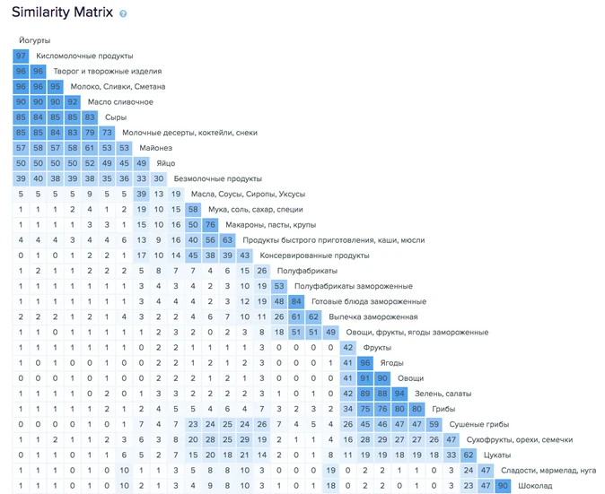
Information Architerture Research
In order to have a better understanding of how we were going to shape navigation, hierarchy, labeling and organization of the content, a study of information architecture had to be done.
It first started with determining the existing tree and picking cards for online and offline cards sorting.
Offline cards sorting gave us the reason why certain things were grouped as they were. Online cards sorting told us how many times they were grouped. We then made a competitive analysis and added usability test findings to create the final tree which then was tested and compared to the existing one.
The similarity matrix from the Optimal Workshop was analyzed for both online and offline cards sorting. It gave us an insight on content hierarchy, organization, and flow. The entire research work was done by the Wargamings UX Lab Department. I received all deliverables upon completion of the study after which I was able to start my part of the work.
Mobile Web Navigation
Navigation should have familiarity and be predictable. Challenged by the small screen, the content should be prioritized and reachable for both the existing and new users.
But what type of navigation should better be used for new mobile web? To decide that, we started with analyzing navigation types that could be used. These were:
1. Hamburger Menu
2. Tab Bar
3. Top Navigation Bar
During the competitive analysis of other navigation types we came across:
4. List Menu
5. Springboard
Hamburger Menu
List Menu
Top Navigation Menu
— If there is not a lot of content and the content can be hidden, it means the user doesn’t use it all the time.
— If the user knows what they are looking for.
⛔
— The Hamburger Menu was used for the existing Wargamings platforms and users struggled to find the content they were looking for.
— It is constantly on the screen and it can be used:
- if content can be grouped into 5 categories maximum.
- if information has a similar importance and needs direct access.
✅
— Cards sorting study revealed that the content was grouped under 5 major titles.
— It can be used if there is less content
— It is more of a desktop trend
✅
— We decided to use the pattern because we had a responsive menu from the desktop version and our users were more familiar with it.
Information Architeсture
Deliverables
Findings from the competitive analysis, the online/offline cards sorting and the usability test revealed that Top Navigation Menu combined with List Menu was the best option for web mobile and desktop.
Web Desktop + Web Tablet
Player Support
Login / Create Account
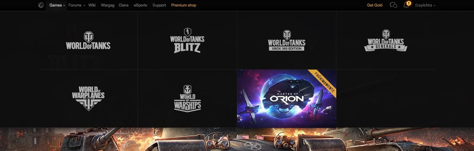
Games
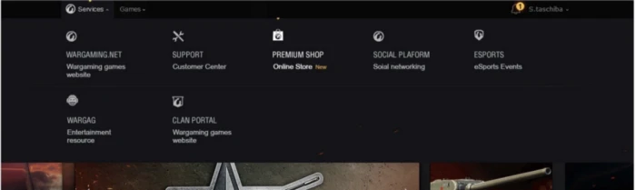
Services
Premium Shop
World of Tanks
World of Warships
Wold of Warplanes
...
...
...
...
Premium Shop
Global Map
Clan Portal
Wargaming Center
Player Support
Wiki
Web Mobile
Games
Services
Login / Create Account
World of Tanks
World of Warships
Wold of Warplanes
...
...
...
...
Premium Shop
Global Map
Clan Portal
Wargaming Center
Player Support
Wiki
Carousel Menu / List Menu
What did the previous version
of the NM look like?
Old Version
The old menu consisted of a grid with games, showing their signature art on hover, and taking the user to the game portal on click. It was simple and succinct, and it did what it was supposed to do.
Process
Version 1.
“Hold on, why don’t we simply take the old NM design as a basis and add some new features to it?” I am sure many designers have heard similar suggestions :)
So why not indeed? We explored that option for a while, but the design ended up being unexciting and overloaded with blocks:
Problems:
• First of all, we didn’t know the max number of games the menu would possibly need to display. Say, a dozen games would require a three-row menu, while twenty or more items would call for an incredibly cumbersome structure.
• Secondly, same as with the old version, this menu logic would limit the functionality to clicking on a game and taking the user to another website, and we wanted to avoid that.
• Too much data in the blocks made it hard for the user to find the specific information they needed.
Version 2.
During the next iteration, we decided to:
• Reduce the size of the logos and add a description of the game/service, taking care of the idea to make some content available for users right away.
• Increase the number of games in each row from four to five.
Problems:
• The biggest problem at this stage was that managers still wanted to add quite a number of games (but that number was unspecified), and the grid layout still resulted in a vertically endless menu area.
Version 3.
Then we decided to make menu items into text buttons as opposed to blocks, which allowed us to noticeably cut the height of the menu area.

Problems:
• This version showed way too little. With the images removed, short lines of text looked dull and unattractive.
• The old issue of not having enough space for game details and links resurfaced again.
Version 4.
Finally, we came back to using scrolling and putting all the game info below the title. Hovering over the image would display the text and the links.
Problems:
• Additional information would show on hover, which meant the user would need to take an extra step after selecting the game in the menu.
• The four initially displayed games now vied for the user’s attention and so lacked impact, even though each had an image.
• The content quantity issue was still around, since the current structure didn’t afford enough space for showing more links and grouping them logically. The management was looking for ways to promote esports and provide links to game forums and events, but this version simply had no room for that.
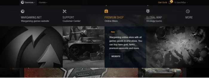
Final Design
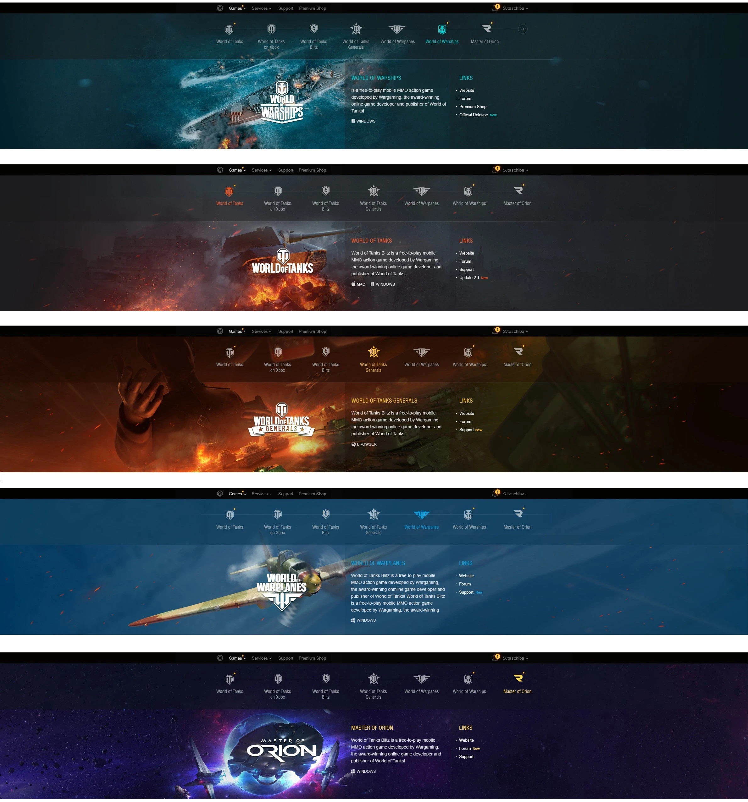
After the fourth iteration, we decided to move away from the old concept of one block per game. The new layout used some scrolling elements and focused on one game at a time. That was the moment the new version of the design started showing through:
• Each menu item now spanned the entire width of the screen when expanded. This made presentation of each game more distinct and colorful, and increased the available space for the game’s description and links (to downloads, forums, events, specials and other goodies).
• Switching between games was now implemented via a horizontal list. This also accomplished an extra objective, providing a mechanism and space for adding any number of games in the future.
• Now there was enough space for the game description and the links, which could be grouped logically.
• Presentation of each game now made an immediate impact, which was exactly what the audience was looking for.
Trying on some art
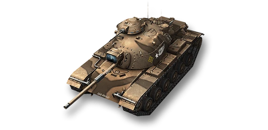
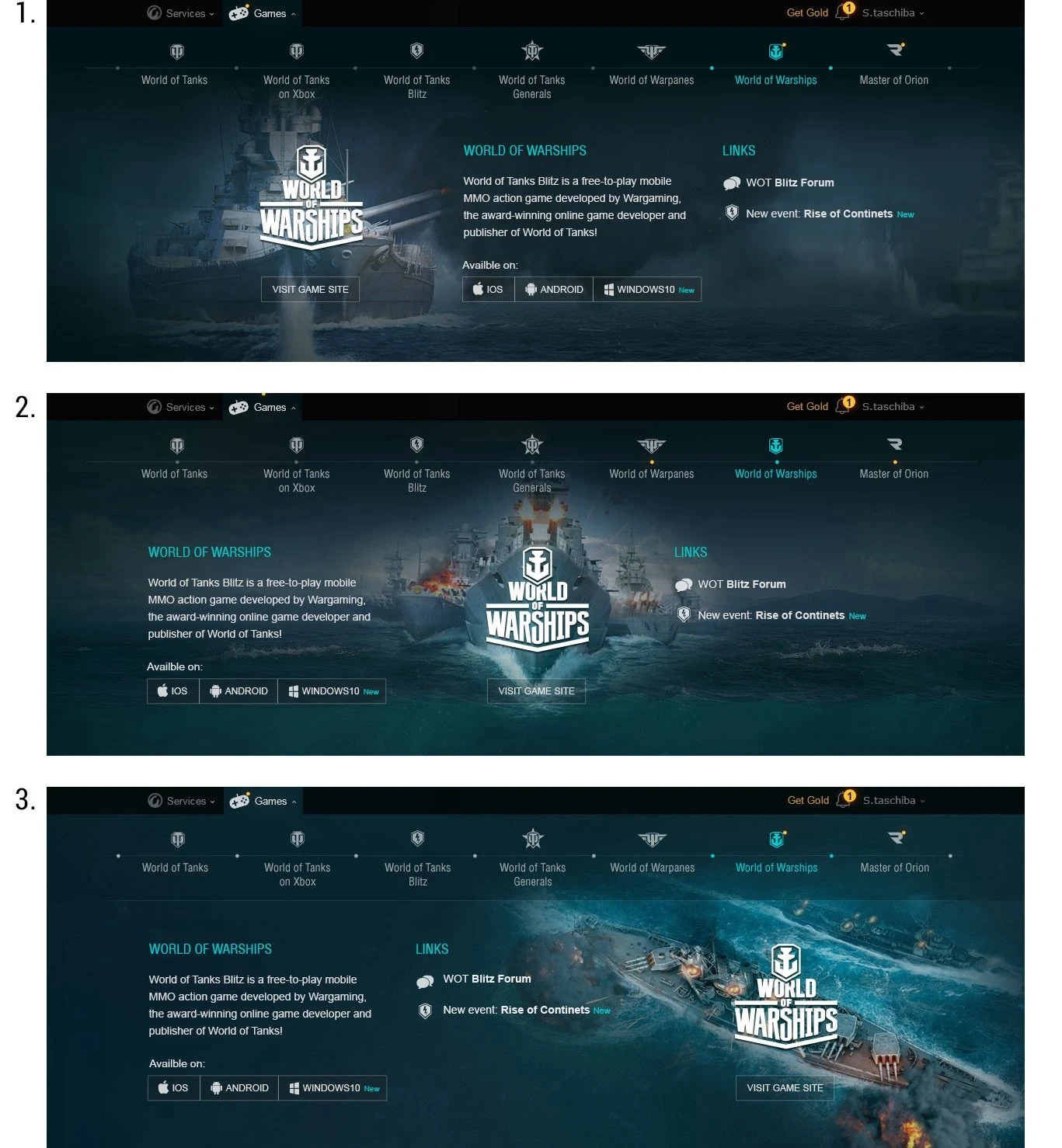
For the final version, we selected the most logical and clear composition of elements in the design. At that point, the next stage began: adapting the initial menu to different games. To see how workable the chosen design was, we started applying different game art to it. Below you can see us playing with World of Tanks Blitz.
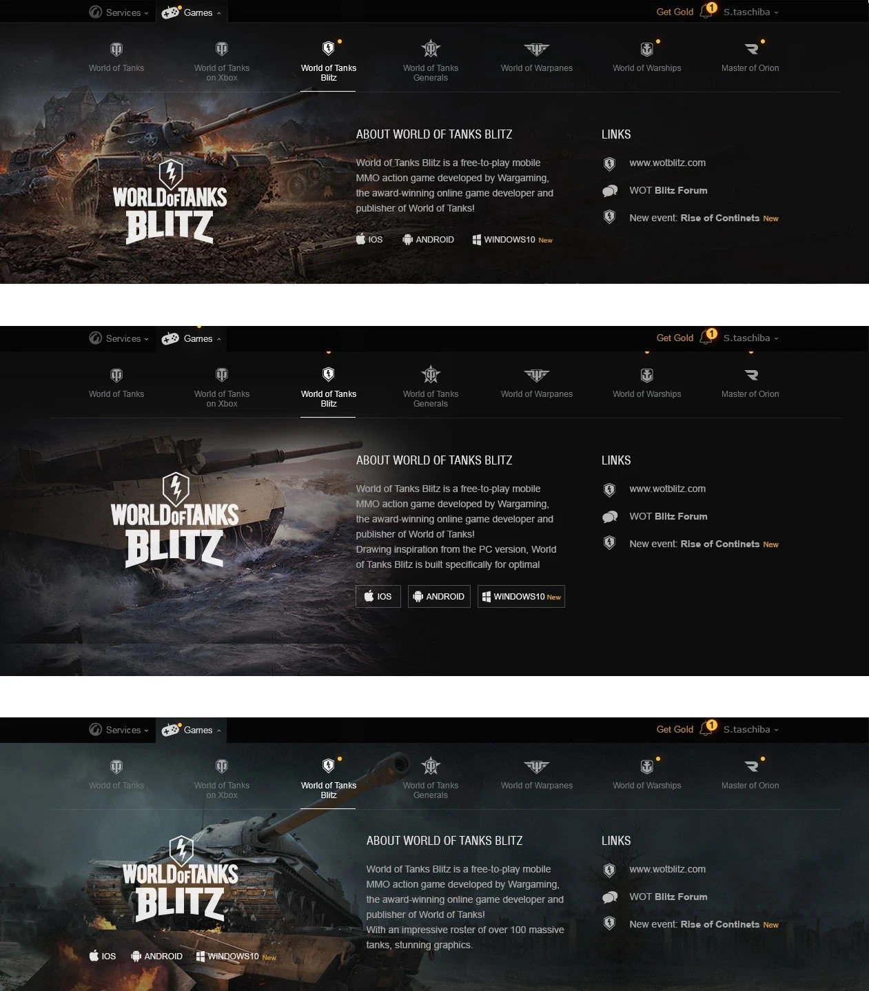
The Art Department
Ours is a large company with a dedicated team for drawing visuals, and our next step was to tap into their creative powers. They provided us with awesome background images, some based on the existing art and others involving completely new designs developed specifically for the menu.
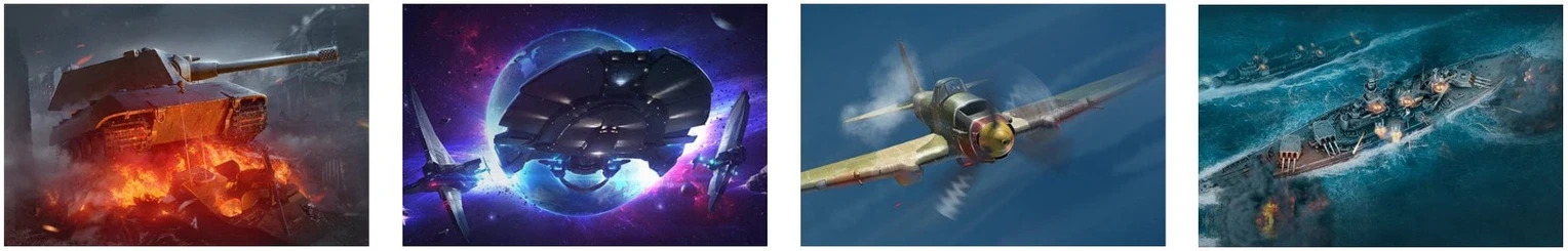
Now each game also had its signature logo and color approved by the marketing department. Below you can see a small collection of art eventually brought together by the art and marketing teams.
• After receiving the illustrations from the Art Department, we realized that in some instances the text was hard to read against the light background, so the final version included two cascading stacks of dark transparent blocks.
Adaptation
Next, we got down to adapting the menu to a variety of platforms with different requirements. We chose the classical layout : blocks left-to-right (on PC), rearranged vertically top-to-bottom (on mobile devices). We also decided to maintain the branding and style of each game and keep the art on all the breakpoints.
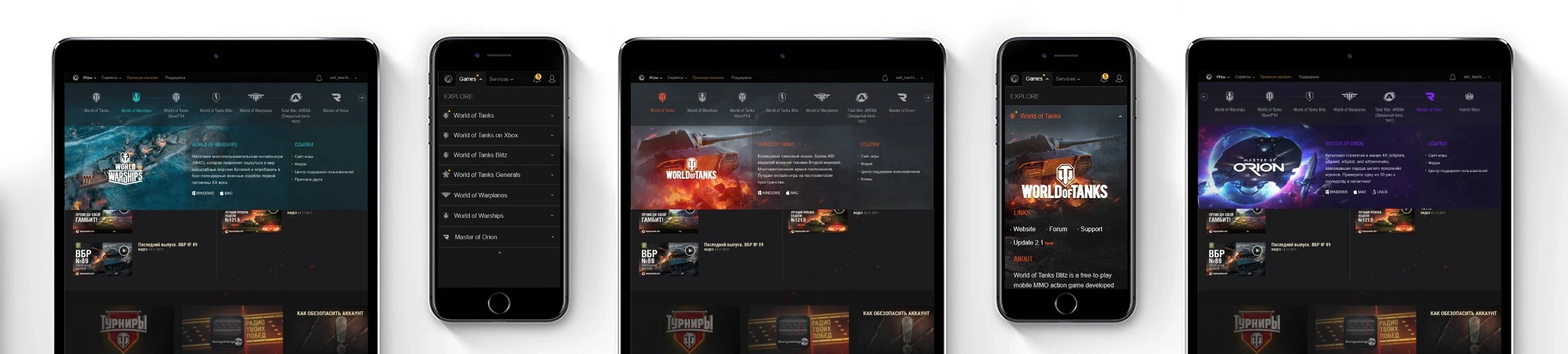
The horizontal desktop layout of the game list regroups into a collapsed vertical list to fit the precious small screen real estate.
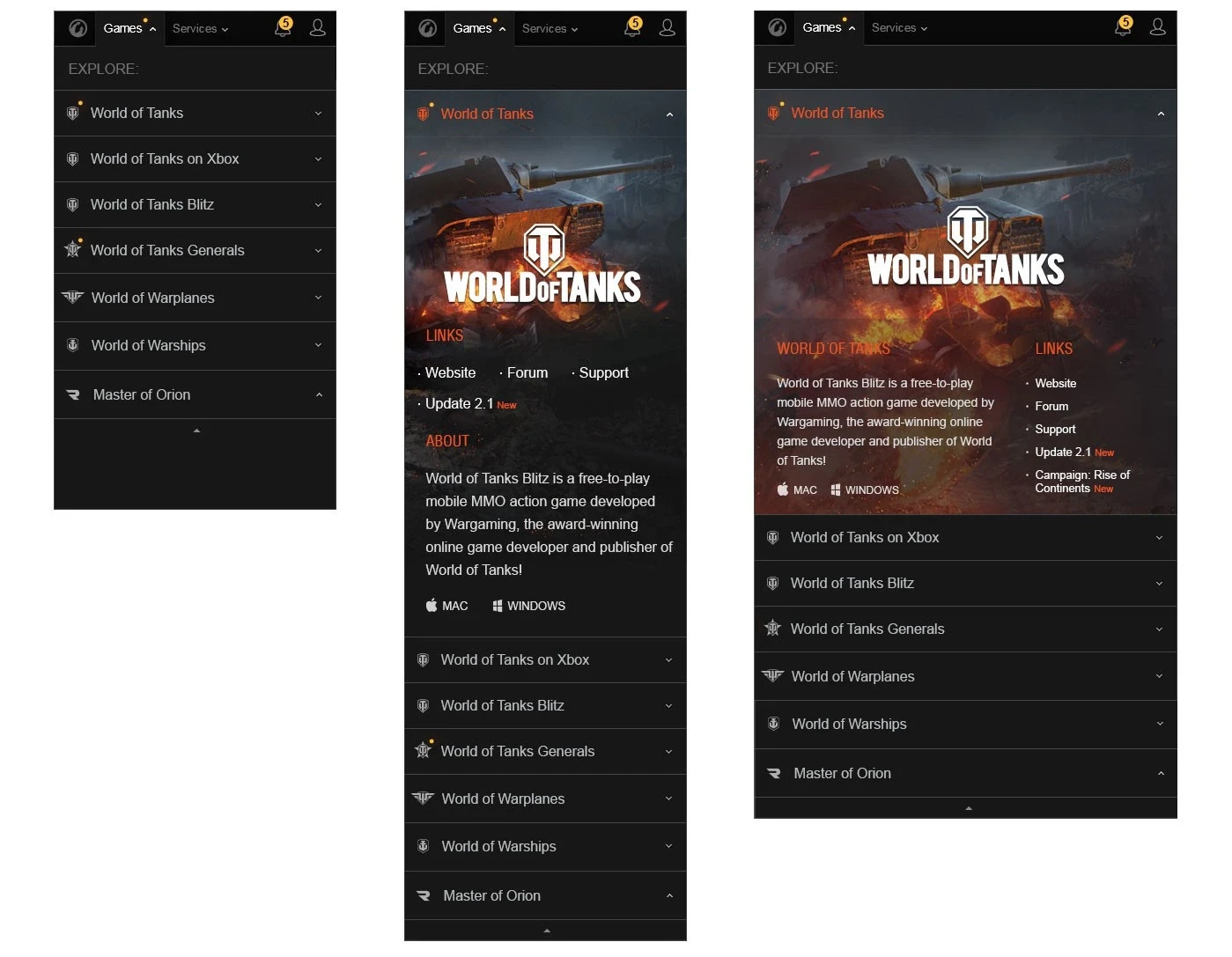
The horizontal desktop layout of the game list regroups into a collapsed vertical list to fit the precious small screen real estate.
User Tests Results
Testing
Our team conducted two iterations of User Tests in two regions. We checked and confirmed most of our hypotheses.
1. With the help of the new design of the menu, the user is able to get complete information about each game, without leaving the site for the new game.
2. The menu now has more space for links such as e-sports and other important business links.
3. A CTA appears on the menu for downloading games on the appropriate device, which was so badly lacking according to the results of a survey of our users.
4. In the opinion of our players, the menu was a kind of boom topic for discussion on the company's blogs, as it began to identify the values of each game. It looks more playable and effective.
Lessons Learned
Over the course of working on this complex but exciting project, I have learned a few lessons I hope you might also find useful:
1. Search for inspiration
Don’t be afraid to suggest new solutions to problems. Depart from the old layout and grid completely. Take a fresh look at the task. Play the company’s game again (if you are working at a game company), study the guidelines, have a look at what your colleagues are doing and what’s going on in the world. Use the best elements from all the sources available — like the most successful texts, icons, arts — and turn these pieces of the jigsaw puzzle into a coherent whole that is meaningful and relevant.
2. First things first, or Understand the big picture
Designing is a problem-solving job. However, besides dealing with the issues directly specified in the assignment, it is important to understand why those needs emerged in the first place and give some thought to possible future developments. Will later on the design be scaled or the requirements towards a certain element raised? Where is the company going? What design-related difficulties may arise? Will the users stick to just one language or is localization likely so the length of words may change?
Before you start, gather as much information as possible on what your design needs to include. My initial mistake of failing to do that kept popping up throughout the process: each new iteration would expose yet another problem of lacking some interface components that weren’t mentioned in the beginning.
3. Be obstinate … sometimes
Stubbornness can be an admirable or notorious quality in a designer, depending on their point of view. If your client, your team or a design assignment insists on simply changing the old design but you are certain that you can make a better one from scratch — go for it. But prepare your arguments and present both old and new prototypes to show the difference between the two and esthetic, business value that everyone will get. Don’t hesitate to go through bungled iterations in your design. What matters is to get useful feedback and learn from your mistakes.
4. Accept criticism … most of the time
A designer who honestly evaluates their performance often finds that a ‘good job’ rejected by a business, art director or team is, in fact, not that ‘good’. More often than not, criticism has a positive effect on the progress and quality of your work. We are all human beings; we all get tired sometimes and stop thinking and seeing clearly. At such moments, quality criticism may do tons of good. That being said, don’t settle for meaningless comments like “Everything is amiss!” or “Something is wrong here!” Ask specific questions, and the answers will start you thinking on how to move on with the project.
5. Check the way your design looks at different breakpoints
Testing at or even making a separate layout for different breakpoints is an absolute necessity. We knew from our analytics that most players used their mobile devices, not PCs, to visit the platform. For this reason, we needed the tablet/mobile versions to be at least as functional and spectacular as the desktop one.
6. Stick to your values
To remain creative, a designer must have the courage to stand up for their beliefs. The fundamental strength of your principles is a source of creative power, along with your talent. If you are asked to produce some run-of-the-mill results — a regular redesign without changing much — take an extra step and do what you believe in. Create something you know will work and demonstrate it to your stakeholders. It may very well be they haven’t even considered the problem from that angle. As Henry Ford said, “If I asked people what they want, they’d ask for a faster horse.” Well, don’t make a faster horse.
Sati Taschiba

Product Designer
Bay Area
If you are thinking about hiring me, would like to discuss a project, or explore a YouTube collaboration, get in touch with me at