UX Case Study
Mobile Web & Desktop

Overview
Indeed is the world’s largest job search platform, helping millions of people find meaningful work globally. With its extensive database of job listings, resume tools, and company reviews, Indeed simplifies the job search process for users and employers alike. This makes designing for Indeed an exciting challenge, as the platform must be intuitive, scalable, and impactful for diverse audiences worldwide.
Mission: We help people get jobs. Globally. For everyone.
60+ Countries and 28 Languages
250M+ Monthly Unique Visitors
Leading Platform for Job Seekers and Employers
Role & Duration
Sr. UX/UI Designer (Full-Time)
Oct 2022 - Aug 2024
Product Team:
Danielle Papermaster - Senior Product Manager
Saachi Kudtarkar - Product Manager
Dana Langseth - Sr. UX Reseacrher
Emma Zigarovich - UX Reseacrher
Ashley Zelaya - Sr. UX Content Designer
Alexander Luo - Sr. Software Engineer
My Role
At Indeed, I applied Human-Centered Design principles to tackle complex challenges, create scalable solutions, and deliver meaningful, user-focused experiences. I led strategic initiatives to enhance user engagement, simplify workflows, and ensure seamless scalability across web and mobile platforms.
In more detail, I was involved in the design and execution of several high-impact projects. I lead large domains such as:
• Privacy Control Update: Led the full design cycle, including market analysis, prototyping, and QA, enabling access to 144M+ non-resume customer profiles.
• Profile Enhancement Initiative: Directed UX design to improve data quality for 245M platform users, significantly advancing the platform’s core strategy.
• AI-Driven Solutions: Spearheaded AI integration into customer profiles, collaborating with cross-functional teams to develop award-winning solutions that improved user engagement.
• Taxonomy Optimization: Quadrupled taxonomy attribute overlaps between jobs and resumes while increasing attribute extraction by 75%, strengthening platform competitiveness.
Applied Skills: Design Thinking, User Journey Mapping, Wireframing, Prototyping, Usability Testing, UX and Visual Design, AI Integration, Design Systems, and Scalability Design.
Final Result
If you’re short on time, here’s a quick overview of the main milestones, which are detailed further in the UX case. You can also click the link below to dive straight into the solutions and results for each milestone.


UX Research


Key Challenges for Job Seekers on Indeed
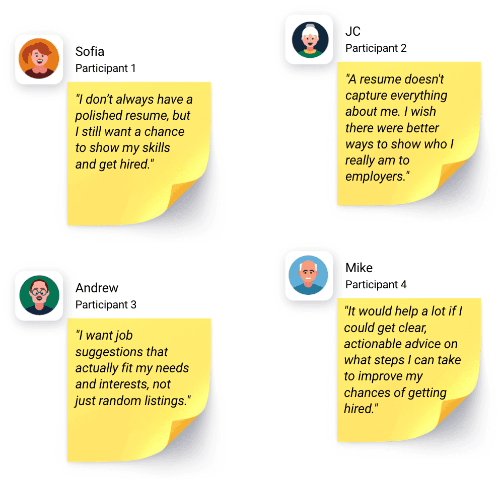
Through research and interviews, we uncovered three primary pain points faced by job seekers:
1. Showcase identity beyond a resume: Job seekers want to highlight their skills and experiences without being confined to a traditional resume format. For example, nurses or babysitters may want to share a video to showcase their personality and abilities, helping employers see who they really are beyond the resume.
2. Get hired without a resume: Many users seek alternative ways to apply for jobs when a resume isn’t readily available. For instance, truck drivers often don’t need a traditional resume; instead, their truck driving license can be enough to start working.
3. Stand out from the competition: Differentiating themselves from other candidates remains a significant challenge for many job seekers.
Addressing these challenges was important to enhancing the job seeker experience, as the current system often limits visibility and can be particularly difficult to navigate for users without a resume.
Key Challenges for Employers on Indeed
Through research and interviews on the employer side, we identified three primary challenges they face:
1. Finding high-quality candidates: Hiring managers often struggle to find applicants who meet their qualifications. For example, Ethan, a hiring manager, shared, “I’m struggling to find candidates who truly meet the qualifications and experience we need. I need more high-quality applicants.” This highlights the need for improved filtering tools to connect employers with the best candidates.
2. Reducing bias during hiring: Ensuring fair hiring practices is a major concern. John expressed, “We want to ensure a fair hiring process, but it’s difficult to reduce unconscious bias without the right tools.” Employers need features that focus on skills and qualifications to help mitigate bias and promote fair evaluations.
3. Understanding candidate fit: Employers often find it difficult to determine if a candidate is the right match. As Nick explained, “It’s hard to quickly tell if a candidate is the right fit for the job just by looking at their resume. I need more clarity on their suitability.” Tools that provide deeper insights into candidates beyond their resumes can address this challenge.
Understanding these challenges helps us design solutions that enable employers to find high-quality talent while ensuring a fair and informed hiring process.

Job Seeker and Employer Needs
To summarize the key needs of both job seekers and employers:
• Job Seekers: Their main priority is to be noticed by employers and recruiters. Many express frustration when their profiles or resumes get lost among countless candidates. They want their skills, experience, and potential to stand out and attract the attention of hiring managers.
• Employers: They need access to a wide talent pool to find the best candidates. However, it’s not just about volume; they also want an efficient system to filter candidates and identify who is the best fit for their roles.
This underscores a core challenge: bridging the gap between job seekers striving to showcase their abilities and employers aiming to quickly and effectively identify top-quality talent.


Background
The Profile on Indeed has traditionally revolved around creating or uploading a resume that job seekers could use for applications and mark as “searchable” for employers. However, as the platform evolved and new features were added to support job seekers throughout their journey, we began collecting richer information about job seekers beyond just their resumes. Unfortunately, this additional information was not accessible to employers. To address this gap, the first step toward reimagining the Indeed Profile was improving the Privacy Control feature.

Why Focus on Privacy Control?
The existing Privacy Control feature was buried under several clicks, making it difficult for job seekers to find and manage. My goal was to redesign the feature to make it more prominent and intuitive, placing it at a higher level within the profile interface. This would enable job seekers to easily control their privacy settings while understanding that these settings impact their entire profile—not just their resume.

Challenge 1

Design Explorations:
1st Round

Design Explorations:
2nd Round
Addressing Job Seeker Concerns
To address job seekers’ feedback from the 1st round—specifically their desire for more upfront information—I created additional design iterations featuring banners that explained what “Let employers find you” means.
Design Iterations:
Design A:
• Pros: The banner was immediately noticeable to 100% of users.
• Cons: Despite its visibility, most users ignored the content due to “banner blindness.”
• Interview Metrics:
100% of users noticed the banner.
80% admitted they didn’t read the content or assumed it was an ad.
Design B:
• Pros: Included clear action steps with interactive buttons, encouraging user engagement.
• Cons: The color choices were less effective in grabbing attention compared to Design A.
• Interview Metrics:
60% of users understood the call-to-action.
Only 30% found it engaging enough to explore further.
Design C (Winner):
• Pros: A compact design and strategic placement of the note significantly improved user awareness. Users noticed and understood the message better than in Designs A and B.
• Cons: Some users misinterpreted the blue color as signaling a “complete” or “correct” status, leading them to believe no further action was needed.
• Interview Metrics:
75% of users noticed and read the note effectively, making it the most successful design for visibility and comprehension.
Key Insight:
Although Design C was the most effective overall, a subset of users mistakenly assumed that the blue color indicated no further action was required. This highlighted the need for clear visual cues that prompt users to take the desired actions.

Final Design
Addressing Color Concerns
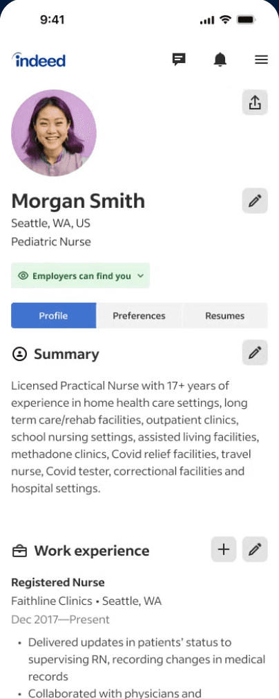
To tackle the blue color misinterpretation from previous research, my final step was to explore alternative colors for status indicators. I implemented green to signify a public profile that is searchable by employers and orange for a private profile. This color distinction helped users immediately differentiate between the two statuses and provided instant visual feedback without requiring them to read additional details.
Final Design Recap
❌ Issues with Previous Design:
• The “Privacy Control” feature was hidden under the three-dot menu.
• Privacy settings affected only the resume, not the entire profile.
• An additional level created unnecessary clicks for the user.
• Many job seekers were unaware of the control since it was buried two clicks away.
✅ Improvements in the Final Design:
• Visibility: The “Employers can find you” status was moved to a prominent position, making it instantly noticeable to job seekers.
• Simplicity: Reduced the number of clicks required to access and adjust key privacy settings.
• Clarity: Implemented clear color indicators (green and orange) for immediate status recognition, enhancing user experience.

After
Success Metrics
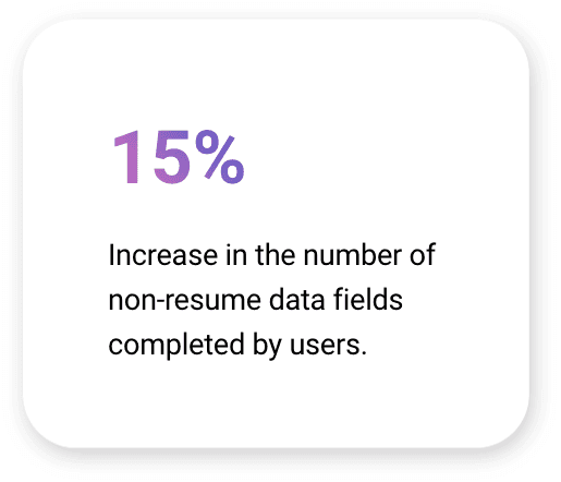
• Improvement: +20 percentage points in Feature Adoption Rate post-redesign.
• Impact: Expanded employer access to 144 million additional profiles, enabling more comprehensive and targeted talent searches.
• Scalability: Unlocked 245 million data points, empowering job seekers to better showcase their qualifications and attract relevant opportunities.
• Efficiency: Simplified 10 key user flows in the job seeker journey, reducing friction and enhancing navigation for a smoother experience.


Users Problems

Challenge 2
Data Merging Challenge
A major UX transformation focused on consolidating all job seeker data collected on Indeed, along with the information from the “Indeed Resume” section, into a unified, comprehensive profile—referred to as the Profile Superset.
Hypothesis
By centralizing the management and presentation of all user data, job seekers will be empowered to enhance their profiles, providing a more complete and impactful representation of themselves to employers.

Solution
Data Merge Alignment Process
While engineers focused on the technical backend of data merging, I proactively developed a detailed “Data Merge Flowchart” to ensure clarity and consistency. This flowchart mapped out all possible merge scenarios, tailored specifically to sections of the Indeed Profile.
Examples of Data Merge Scenarios:
1. Work Experience Misalignment:
• Titles differ, dates don’t align, and an existing experience entry is already present in the Indeed resume.
2. Education Inconsistencies:
• Titles and schools match, but one data set lacks date information.
3. Language Proficiency Discrepancies:
• Languages match, but proficiency levels do not align.
This approach bridged gaps between backend operations and user-centric design, minimizing errors and enhancing the user experience.

Result:
1. I documented 15 sections in total, with a primary focus on 5 key sections, identifying 12 potential data merge scenarios.
2. The comprehensive documentation improved efficiency by streamlining communication, minimizing the need for frequent meetings with engineers, and ensuring seamless alignment among all stakeholders.

Challenge 3
Consistency Between Profile ↔ Employers
The next challenge in my work was ensuring a consistent user experience across various flows and departments, which proved to be difficult, especially when different teams managed distinct aspects of the user interface.
At the time I began working on the Profile Reimagining Product, resumes were the primary data source for our sourcing products. Job seekers who didn’t upload a resume on Indeed remained unreachable, limiting the availability of candidates for employers.
Goal
The goal was to expand the pool of available candidates by incorporating job seekers without resumes into sourcing workflows on the employer’s side.

Solution
External Partnership Collaboration
To achieve the goal, I initiated an organizational alignment process. As part of the Profile Department, my team held monthly meetings with the Apply, Enterprise, and Small Employers teams. These meetings ensured alignment and provided an opportunity to share our vision, enabling these teams to anticipate Profile changes and begin shaping their strategy for the Employer side.
Simultaneously, I collaborated with Principal and Staff Designers to ensure my designs followed the correct strategic direction. This collaboration allowed me to refine my work and address any potential gaps in my design approach.

Challenge 4
First-Time Profile Visit Issue
We needed to validate this UX shift with job seekers to understand how they would respond to a significant change in how their information was managed and displayed. The problem was that job seekers’ data was collected from various sources, but they didn’t know where it was stored, which data represented them, or how to update it.
The solution was to educate job seekers during the initial data merge about their new Profile, which was designed to provide transparency and control.
• Automatic Data Merge: Data from multiple sources was automatically consolidated into a single profile, eliminating the need for users to manually merge it.
• Ease of Management: Job seekers were empowered to review and adjust the merged data in one central place, ensuring accuracy and reducing effort.
This approach prioritized simplicity and user clarity while addressing frustrations with data management.
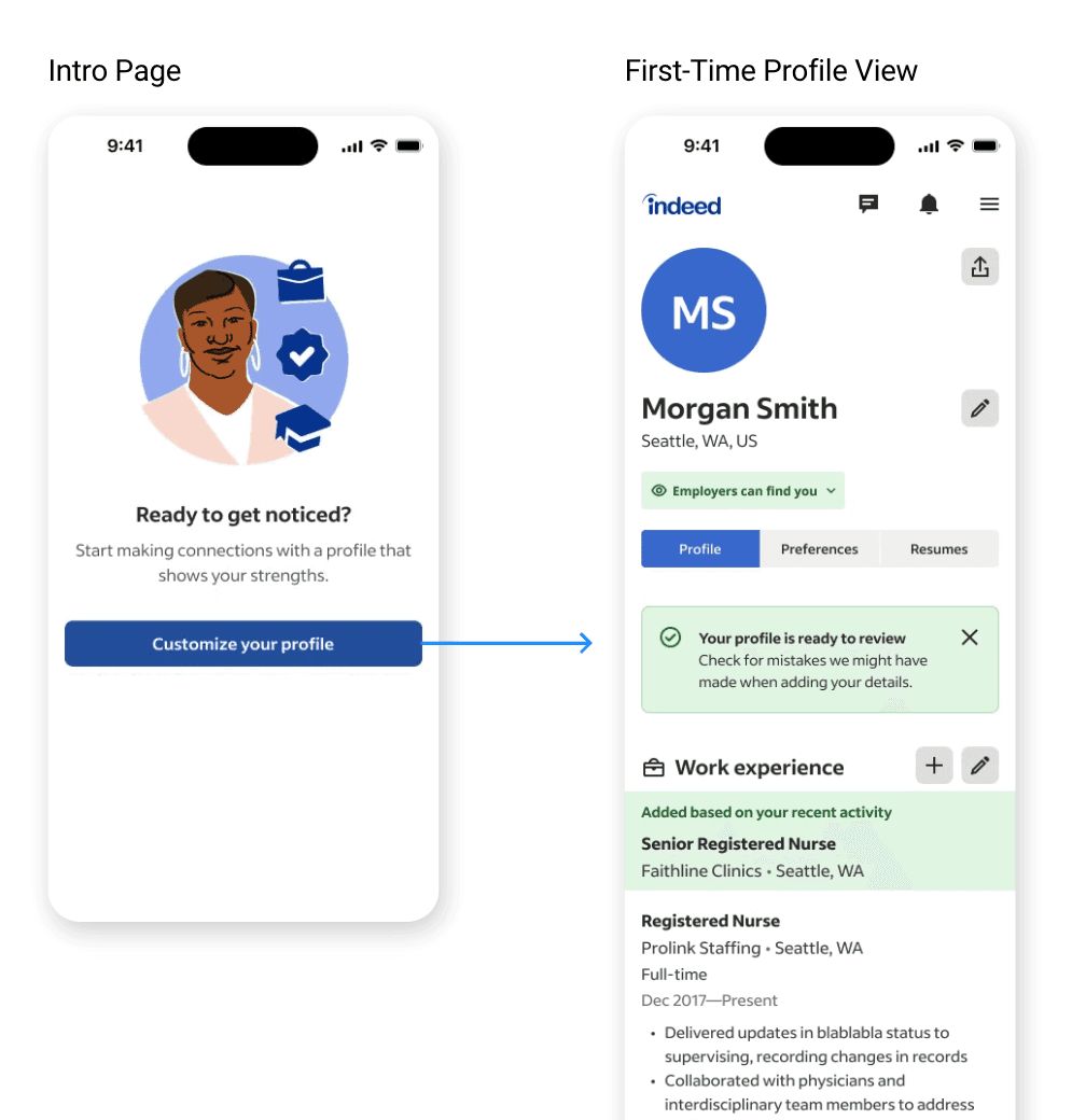
Solution
Next, I address the challenge of ensuring job seekers understand and interact with their new Profile, which consolidates and highlights merged data from multiple sources. The goal was to create a design solution that not only educated users about this significant change but also provided a clear, intuitive way to review and manage their data.
Below, I showcase my visual design explorations for this solution, focusing on how to best highlight the newly merged data. After thorough testing and feedback, Design 3 emerged as the winner, striking the right balance between clarity, usability, and engagement for job seekers.

Final
RITE Study Research
The Rapid Iterative Testing and Evaluation (RITE) method was crucial in addressing usability challenges quickly and effectively. RITE focuses on evaluating a solution to usability problems multiple times in a rapid, iterative manner. This approach not only identifies usability issues but also allows us to react swiftly and test new solutions. The ultimate outcome of a RITE study is an experience that has been thoroughly usability tested, providing high confidence in its readiness for shipping. This minimizes uncertainty about whether a proposed solution will meet user needs.
Why RITE?
The tight project timeline required a method like RITE to deliver rapid iterations, ensure usability, and confidently move forward with solutions within limited time constraints.
My Contributions
I designed the Profile User Flows Diagram: I created this as part of the MVP UX Proposal for the Profile Experience, ensuring alignment and collaboration with teams such as RCS, JSU, and others. Also this documentation helped to collaborate with engineers and helped them on building a live-data prototype.
This initiative aimed to establish a cohesive profile experience that enables job seekers to effortlessly manage their information and understand their visibility to employers and job matching on Indeed.
As results Qual Metrics Measured with UXR:
✅ Increased understanding in the value/purpose of a Profile
✅ Ease of use—job seekers can find and keep their data up to date

Final Design
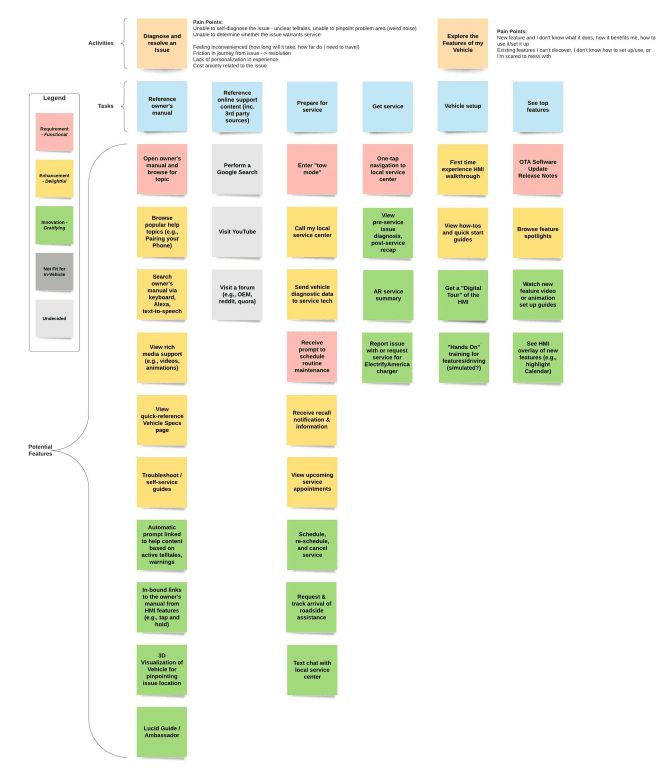
Owner’s Manual Digitalization
For the entire Digital Help Center project, the development of the Digital Owner’s Manual was set as a priority. It was intended to be a text document with a clear hierarchy and navigation. Therefore, it was decided that its content should be placed on the center screen of the CID inside the car.

Success Metrics
After identifying user issues, I began improving the OM navigation by trying different navigation layouts on our product.